Kaiser Permanente
Kaiser members got bills they couldn't understand, and called support instead of paying them. I redesigned the claims experience — list, detail, denials, mobile — so members could see what they owed and why, without picking up the phone. In 2026 I rebuilt the same design as a fully functional prototype, directing Claude Code through Figma MCP.
Highlights
- A two-slot badge system (status + financial) tells a member what happened and what to do next, before they click into a claim.
- Rebuilt the entire 2020 design as a live, responsive prototype in 2026 — Claude Code reading real component data via Figma MCP, directed by a CLAUDE.md brief written before any code existed.
- Reframed cost as savings, not debt: a member sees Kaiser absorbed $155 of a $185 charge before they see the $30 they owe.
- Denied claims surface the real denial reason in plain language, plus the 180-day appeal window, instead of a generic template.
01Project Brief
Kaiser had the data to explain every charge, but none of it reached patients in a form they could use. I joined to redesign the medical claims experience for members, on web and mobile, so a bill wouldn't just be accurate — it would be understandable.
Project Brief
Kaiser had the data to explain every charge, but none of it reached patients in a form they could use. I joined to redesign the medical claims experience for members, on web and mobile, so a bill wouldn't just be accurate — it would be understandable.
Overview
I joined Kaiser Permanente to redesign the medical claims experience for members, on web and mobile. Kaiser had the data to explain any charge — the problem was that none of it reached patients in a form they could use. Members getting billed after a visit had no reliable way to see what they owed, why, or what to do next, and medical billing is already one of the more anxiety-producing experiences in American life. The result was predictable: confusion, and a high volume of support calls from people who weren't disputing their bill, they just didn't understand it.
02Research & Discovery
Research showed the real gap wasn't insurance literacy — it was whether the interface had ever explained anything at all. One member, settling a family member's final claim, got numbers from the system and nothing else. That reframed the whole project: not "how do we display claim data," but "how do we help someone understand what happened to them financially."
Research & Discovery
Research showed the real gap wasn't insurance literacy — it was whether the interface had ever explained anything at all. One member, settling a family member's final claim, got numbers from the system and nothing else. That reframed the whole project: not "how do we display claim data," but "how do we help someone understand what happened to them financially."
Listening to members
Research involved listening sessions on member support calls and review of claims-related call volume data. What emerged was a clear and consistent pattern: the gap between members who understood their claims and those who didn't wasn't about education level or financial sophistication. It was about whether the interface had ever explained anything to them.
Members who understood insurance — who knew what a deductible was, what a plan phase meant, what copay versus coinsurance meant — navigated the existing experience adequately. Everyone else was lost. The existing design made no attempt to bridge that gap. It surfaced transaction codes, remark descriptions, and clinical terminology without translation.
The real question members were asking
One member calling in had just lost a family member and couldn't understand why she owed anything on his final claim as the account holder. The system gave her numbers. It gave her nothing else.
That research anchored every design decision that followed. The question wasn't "how do we display claim data?" It was "how do we help someone understand what happened to them financially after a medical visit?"
The existing experience
The prior claims interface showed members a table of line items — procedure codes, charge amounts, and remark descriptions — with no plain-language interpretation. Codes like "[24] Pmt adjusted, charges covered under capitation agreement / managed care plan" appeared without explanation. Members saw numbers but not meaning.
03Key Decisions & Tradeoffs
Six decisions shaped the redesign: a two-badge status system scannable at a glance, a properly componentized Figma system built for Claude Code to read accurately, a table view preserved for power users, claim detail surfaced as an overlay instead of a new page, denied claims explained in plain language with the appeal window front and center, and mobile carrying the exact same information architecture as desktop.
Key Decisions & Tradeoffs
Six decisions shaped the redesign: a two-badge status system scannable at a glance, a properly componentized Figma system built for Claude Code to read accurately, a table view preserved for power users, claim detail surfaced as an overlay instead of a new page, denied claims explained in plain language with the appeal window front and center, and mobile carrying the exact same information architecture as desktop.
1) A claims list built for scanning
The redesigned claims list surfaces the information members need before they click anything: service date, what care was received, status, and what they owe. Status badges — Pending, Approved, Denied, Needs Payment, Payment Resolved — are visually distinct and placed consistently so members can scan the list and understand the state of each claim at a glance.
Two badge slots do the work: primary status on the left, financial status on the right — a card with no secondary badge means nothing is owed. Members can toggle between card and table view; both open the same claim detail overlay.
2) Building the component system in Figma
Every element visible in the claims list is a properly constructed Figma component, not a collection of static frames. Each badge variant is built with auto layout, named layers, and design tokens applied to every fill, stroke, and text style. The claim card is a parent component with nested badge instances, so any card can be updated by swapping a badge variant from the properties panel.
Naming follows a consistent slash-separated hierarchy throughout the file — badge/pending, badge/approved, card/default, card/hover, card/selected. That structure is what lets Claude Code, reading the file via Figma MCP, navigate it accurately and generate code that references the right component at the right state, instead of approximating from a screenshot.
3) Table view, for members who prefer density
The original experience was table-only. Rather than abandoning it, I preserved the table as an option for members who prefer scanning a dense list. The redesigned table replaces procedure codes with plain-language care descriptions, and applies the same badge system as the card view.
4) Claim detail, context without navigation
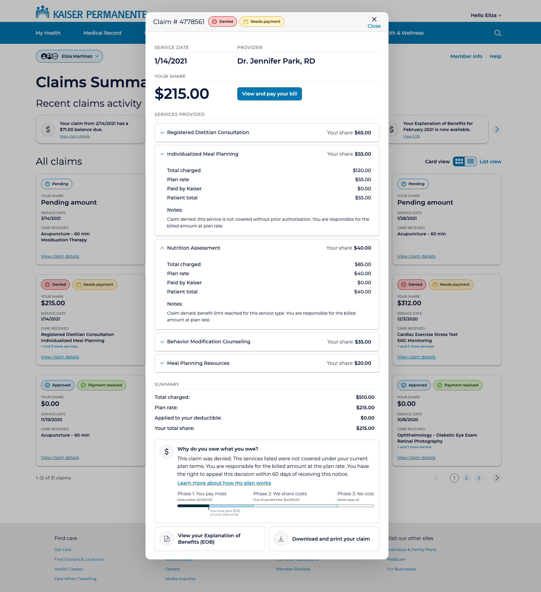
Rather than navigating members away to a full detail page, I surfaced claim detail in an overlay, accessible directly from the list without losing context. The overlay leads with the most urgent information: claim number, status, service date, provider, and the member's total share, large and unambiguous.
I deliberately reframed cost as savings rather than debt. A member who understands their $30 copay comes after Kaiser absorbed $155 of a $185 charge has a fundamentally different relationship with that bill.
5) Denied claims, explained
Denied claims require a different tone. The overlay surfaces a plain-language denial reason for each affected service, the appeal window (180 days), and a direct link to the appeal process. The "Why do you owe what you owe?" section adapts its language to the claim's status instead of defaulting to a generic template.
6) Mobile carries the same information
The mobile experience collapses the four-column card grid to a single column, with the same card component and badge system. No information is removed. I didn't bring list view to mobile — card view is the default and only option, which fits how mobile users most commonly encounter the product: checking on a specific claim after a notification.
04How I Built It in 2026
Returning to this project in 2026, I rebuilt the Figma file with real design tokens and used Claude Code with Figma MCP to generate a fully functional prototype directly from the design data. A CLAUDE.md briefing file, written before any code existed, kept the AI building to spec instead of guessing.
How I Built It in 2026
Returning to this project in 2026, I rebuilt the Figma file with real design tokens and used Claude Code with Figma MCP to generate a fully functional prototype directly from the design data. A CLAUDE.md briefing file, written before any code existed, kept the AI building to spec instead of guessing.
From Figma to working prototype via Claude Code
Returning to this project in 2026, I rebuilt the entire design system from scratch in Figma — proper design tokens, a two-layer primitive and semantic token architecture, auto layout components with named layers and variants, and a component set covering every badge state and card configuration.
I then used Claude Code with Figma MCP to read the design file directly and generate a fully functional HTML prototype. The Figma MCP connection gives Claude Code access to the actual design data — component names, token values, layer structure, spacing — rather than just a screenshot.
CLAUDE.md — briefing the AI before it builds
Before writing a single line of code, I created a CLAUDE.md file in the project directory, a plain-language briefing document Claude Code reads at the start of every session. It defines the file structure (HTML for markup, CSS for styles, data.js for content, app.js for behavior), the exact color tokens, typography specifications, component dimensions, and badge logic rules.
This single file prevented most of the iteration cost that would otherwise come from Claude Code guessing at design intent. When it knows the rules before it starts, it builds to spec rather than building its best approximation and waiting for corrections.
What the AI workflow taught me
The highest-value moments in the build were not when Claude Code got things right automatically — they were when I identified what it got wrong and corrected it precisely. The badge SVG icons, the deductible progress bar segmentation, the overlay centering on mobile: these required specific, directed prompting that came from understanding both the design intent and the constraints of the implementation.
AI-assisted prototyping compresses the time between design decision and testable artifact. The judgment about what the artifact should be, and whether it succeeded, remained entirely human.
05Validation & Reflection
Usability testing with real members showed comprehension improved for everyone, and the literacy gap narrowed — the real goal, not just accurate-looking data. Rebuilding it in 2026 confirmed the original design thinking held up; what changed was how far I could take the execution.
Validation & Reflection
Usability testing with real members showed comprehension improved for everyone, and the literacy gap narrowed — the real goal, not just accurate-looking data. Rebuilding it in 2026 confirmed the original design thinking held up; what changed was how far I could take the execution.
Usability testing results
We tested with real Kaiser members across a range of insurance literacy, not just people who already knew what a deductible was. Comprehension improved over the existing experience for both groups, and the gap between them narrowed, which was the actual goal. A redesign that only worked for members who already understood insurance wasn't doing its job.
Reflection
This project reinforced something I carry into every healthcare and enterprise engagement: the interface is never neutral. A claims screen that shows accurate data but explains nothing still isn't neutral — it works for members who already understand insurance and fails everyone else, in predictable ways. Designing for comprehension, not just accuracy, is an ethical call as much as a design one.
The work also sharpened my instinct for emotional context in functional design. A billing interface is not just a transaction tool. It arrives in people's lives during moments of physical vulnerability and financial stress. The plain-language cost explanation, the deductible phase tracker, the appeal guidance on denied claims aren't decorative; they're the design doing its most important work.
Rebuilding this in 2026 added a different kind of reflection. The design thinking held up — badge-first scanning, overlay over navigation, plain language throughout were sound decisions in 2020 and still are. What changed was the execution and its reach. Today I can build a working prototype with AI tools like Claude Code that functions as a real application: the overlays open, the data populates, the views toggle. That's more useful for engineers who need to understand interaction behavior before building, for stakeholders who need to experience the product rather than imagine it, and for me, to see how my decisions actually function.
What This Demonstrates
The interface is never neutral. A claims screen that shows accurate data but explains nothing still isn't neutral — it works for members who already understand insurance and fails everyone else, predictably. Designing for comprehension is an ethical call as much as a design one.
Rebuilding this in 2026 didn't change the underlying decisions — badge-first scanning, overlay over navigation, plain language throughout all held up. What changed was what I could put in someone's hands: a working prototype instead of static screens, so engineers, stakeholders, and I could all see how the design actually behaves.